
Homebase users feel overwhelmed by the fragmented nature of staff scheduling requests, leading to missed changes, communication breakdowns with staff, and a persistent feeling that they're neglecting more impactful aspects of their role. The purpose of this project was to improve homebase's scheduling features, as individuals who were familiar with the application due to our workplaces.
UCSD '25 UX Project
Timeline: 10 weeks (January 2025 - March 2025)
Collaboration (Team of 3)
Role: UX research, Strategy, Outlining, Design curation
An Overview
Each week managers find themselves having to create weekly work schedules that can fit their employee's availability, qualifications, and preferences to ensure a smooth operation of the store. With multiple staff members, it becomes challenging to track every variable, and even more difficult to do so without some frustration. Managers struggled to access critical information while creating schedules leads to conflicts and general inefficiency.
Our team's focus then was to reimagine how availability data was visualized and accessed within the scheduling workflow, and the solution we crafted brings the information forward at the right time.
It resulted in managers being able to craft schedules with confidence, with a clearer and larger picture of staff availability and qualifications exactly when they needed it most.
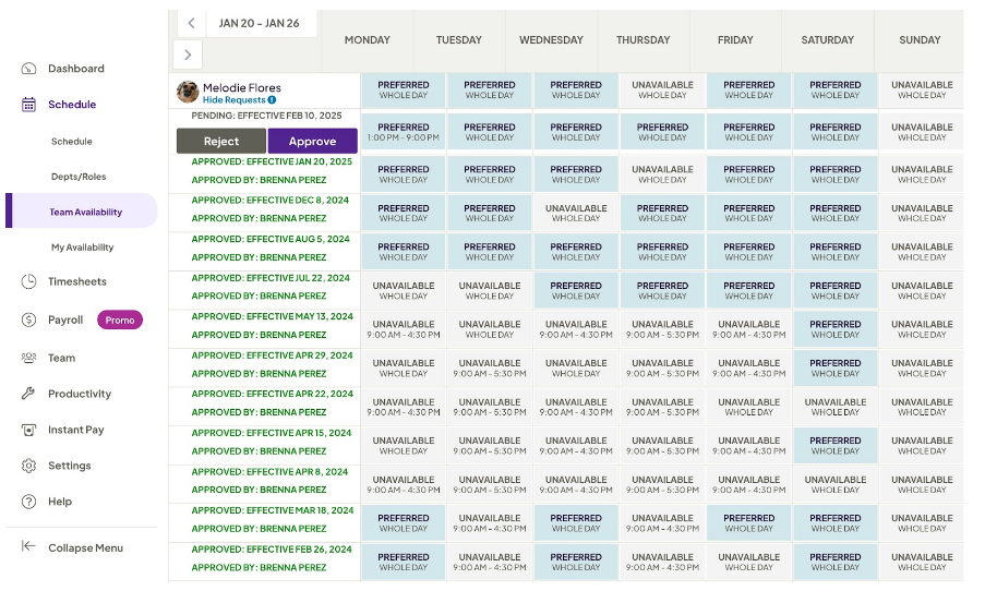
Original Availability Screen
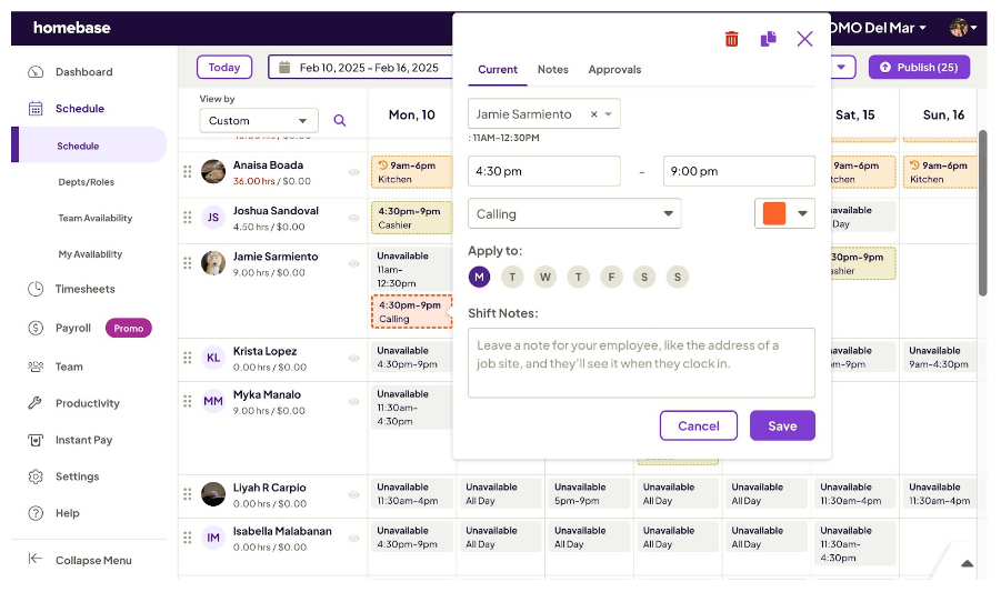
Original Scheduling Screen
Schedule continued
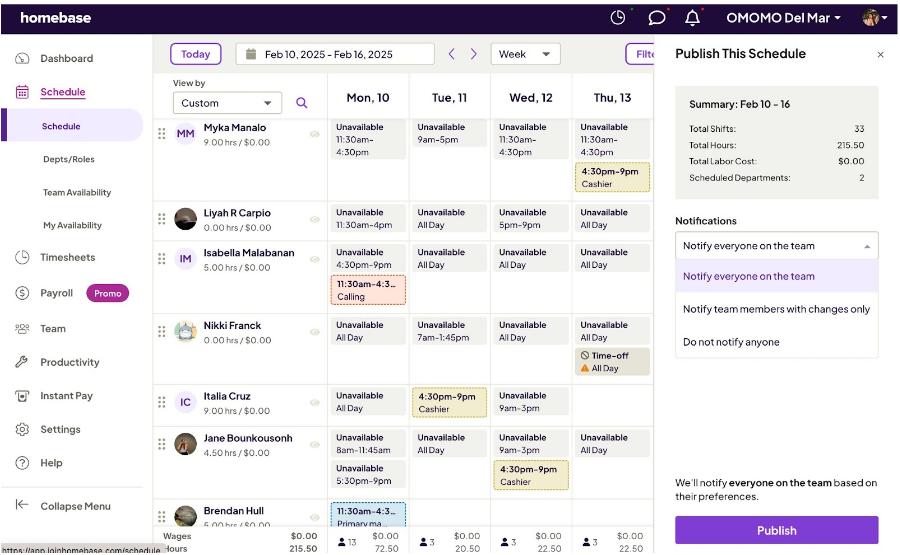
Schedule publish screen
Pain Points:
Homebase has a tendency to bombard it's users with a LOT of information at once. During testing, there were five big pain points that were found:
- Employee default sort order was difficult to navigate through
- Managers couldn't see schedule notes from employees, nor the date of the request
- Employees can submit their hour requests, but it isn't reflected in the schedule
- Requires an outside resource for keeping track of employee tiers and preferred hours
The Approach
Armed with this information, we set out to reorganize the application scheduling view to improve accessibility and most of all - visibility. Simplification of the information presented led to a lower cognitive load among the the users that were tested, and led to the creation of screens that had better visual cohesion than before.
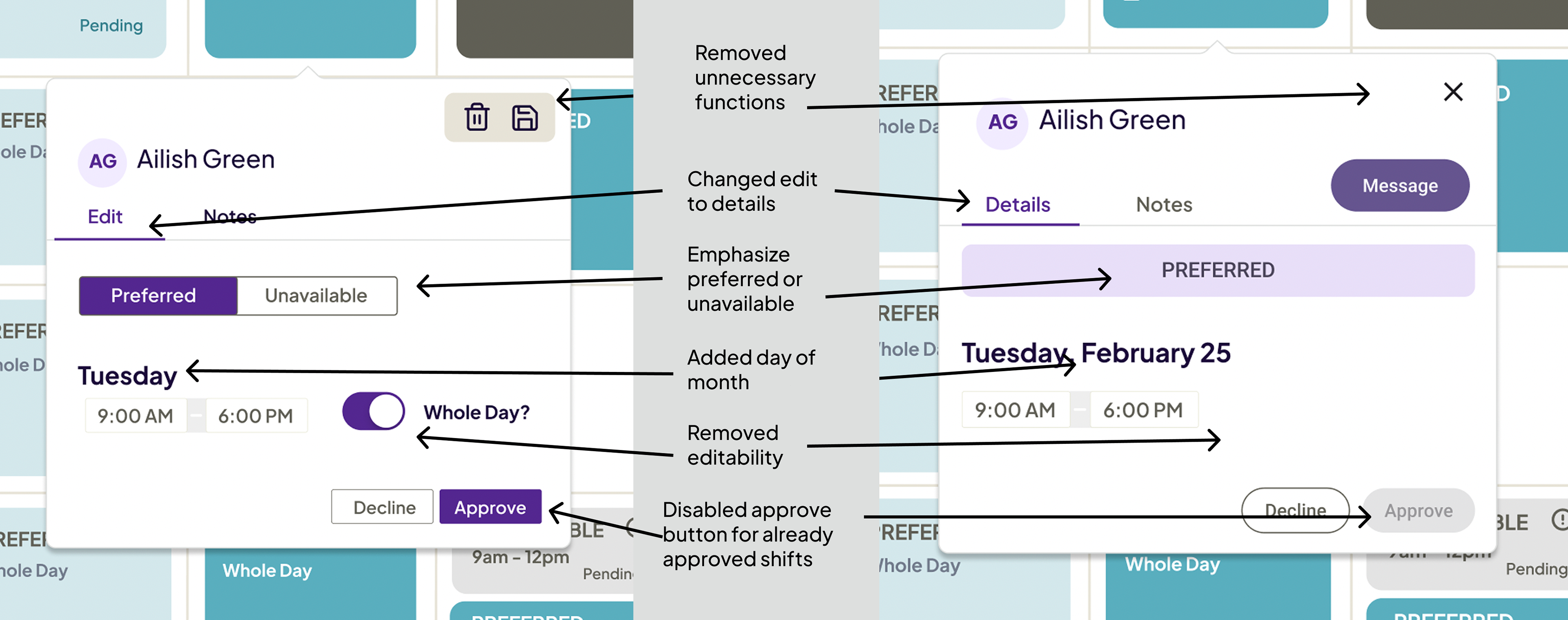
Before and After - 1
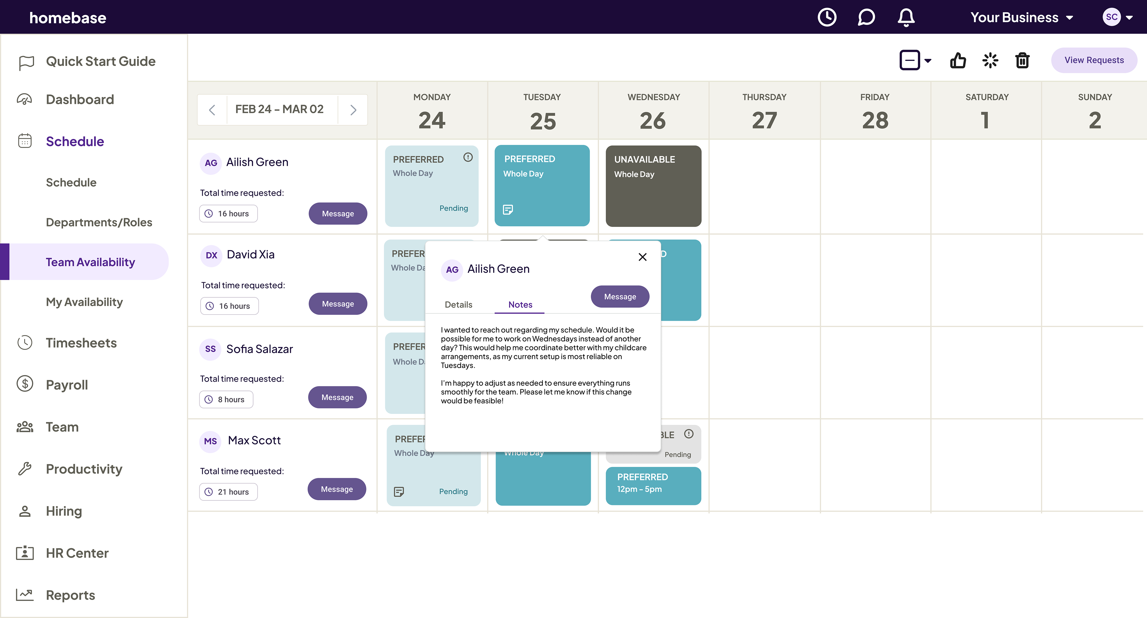
The Employee Availability Approval screen was updated for clarity and usability. The edit button was replaced with a details button, and unnecessary save and delete functions were removed. The approve button is now disabled when unusable to prevent confusion. Employee availability status was made more distinct, and full dates replaced day-only labels based on user feedback.
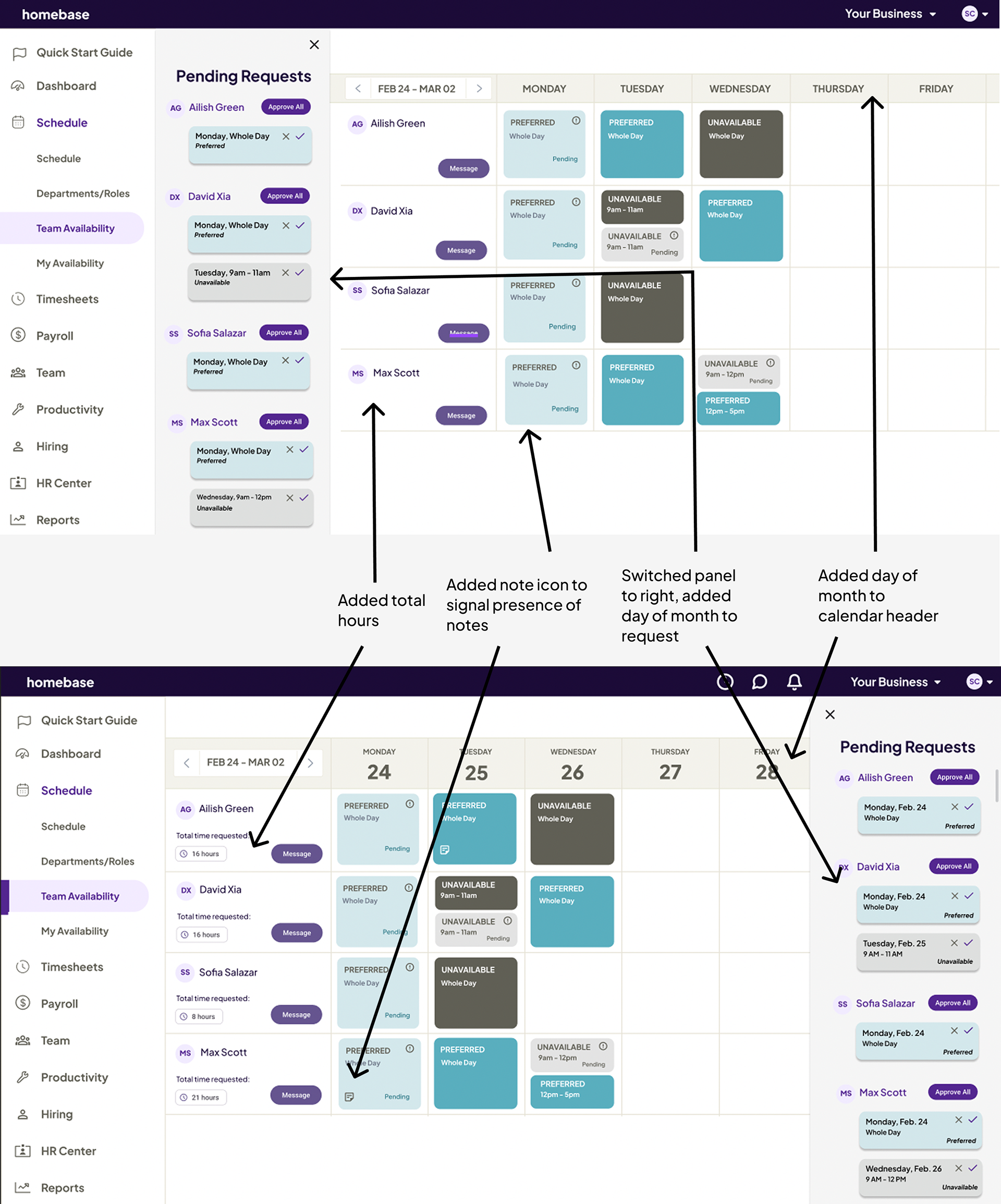
Before and After - 2
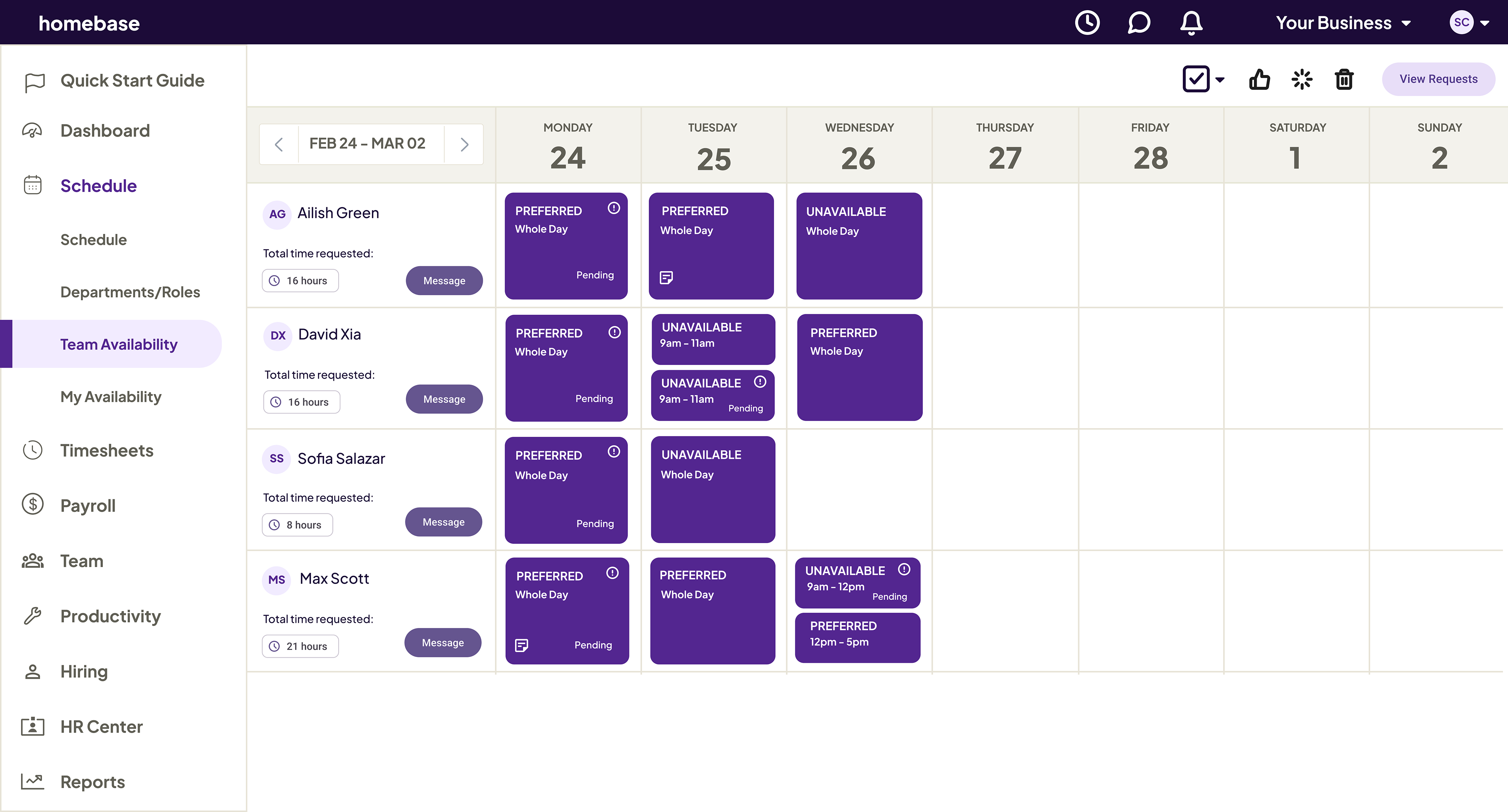
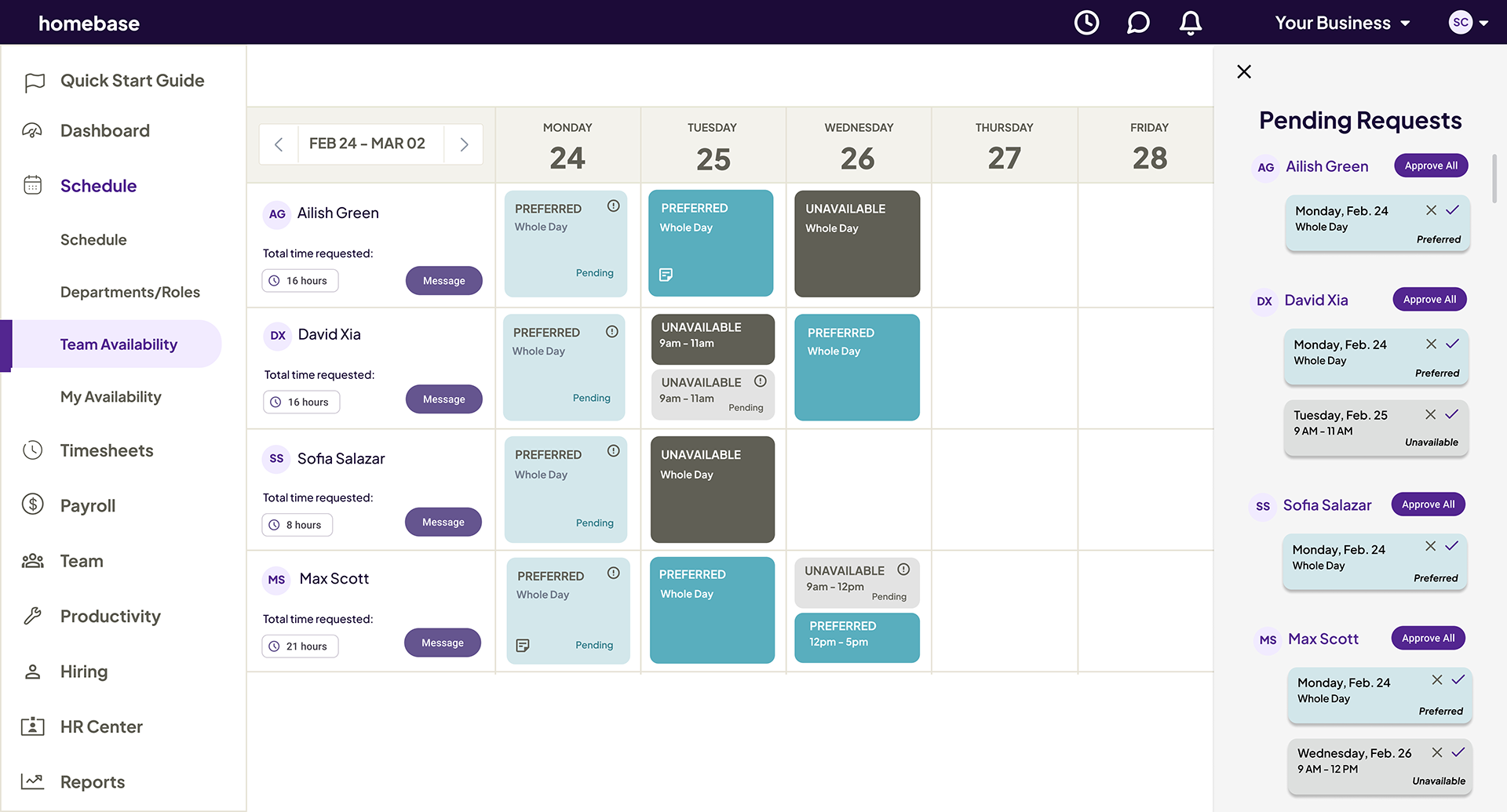
The Team Availability screen was improved for better workflow. The pending requests panel moved to the right for accessibility, and a note icon was added to highlight employee notes. The calendar header now shows both the day’s name and number for clarity. A total hours display was also added to give managers a clearer schedule overview.
Solution and Other Changes
Users struggled to locate key features like the “View Request” button and notes section, so their visibility and placement were improved for easier access. The approval process was refined based on feedback, allowing approvals by day while keeping the "Approve All" option.
Layout and UI updates included moving the pending request pop-up to the right, making the left menu collapsible for better usability, and displaying full dates and requested hours for clearer scheduling.
A month-view option was also added to help managers track trends. To streamline functionality, editing employee availability was removed, color contrast between request types was improved, and visual clarity was enhanced for a more efficient design.
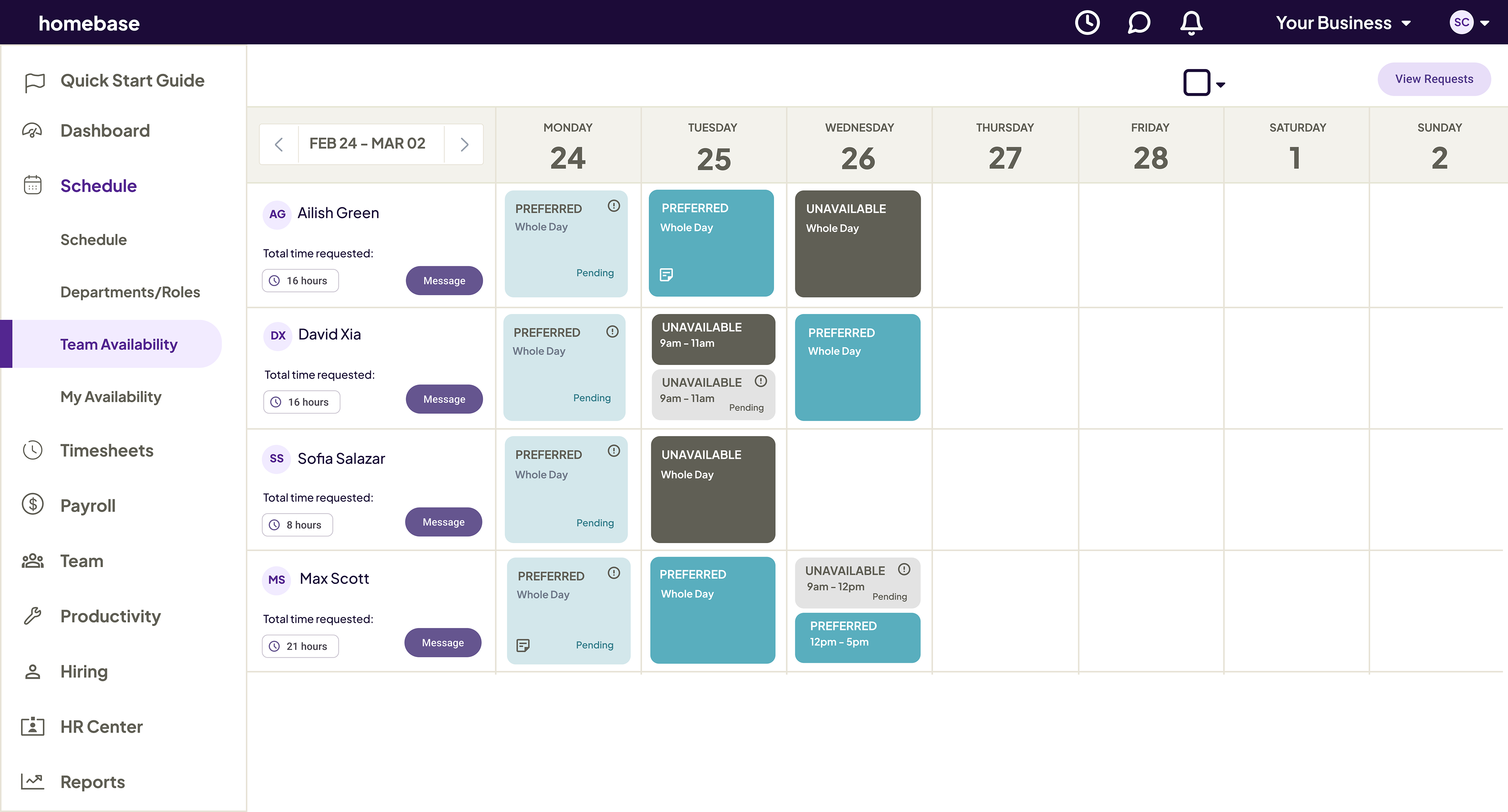
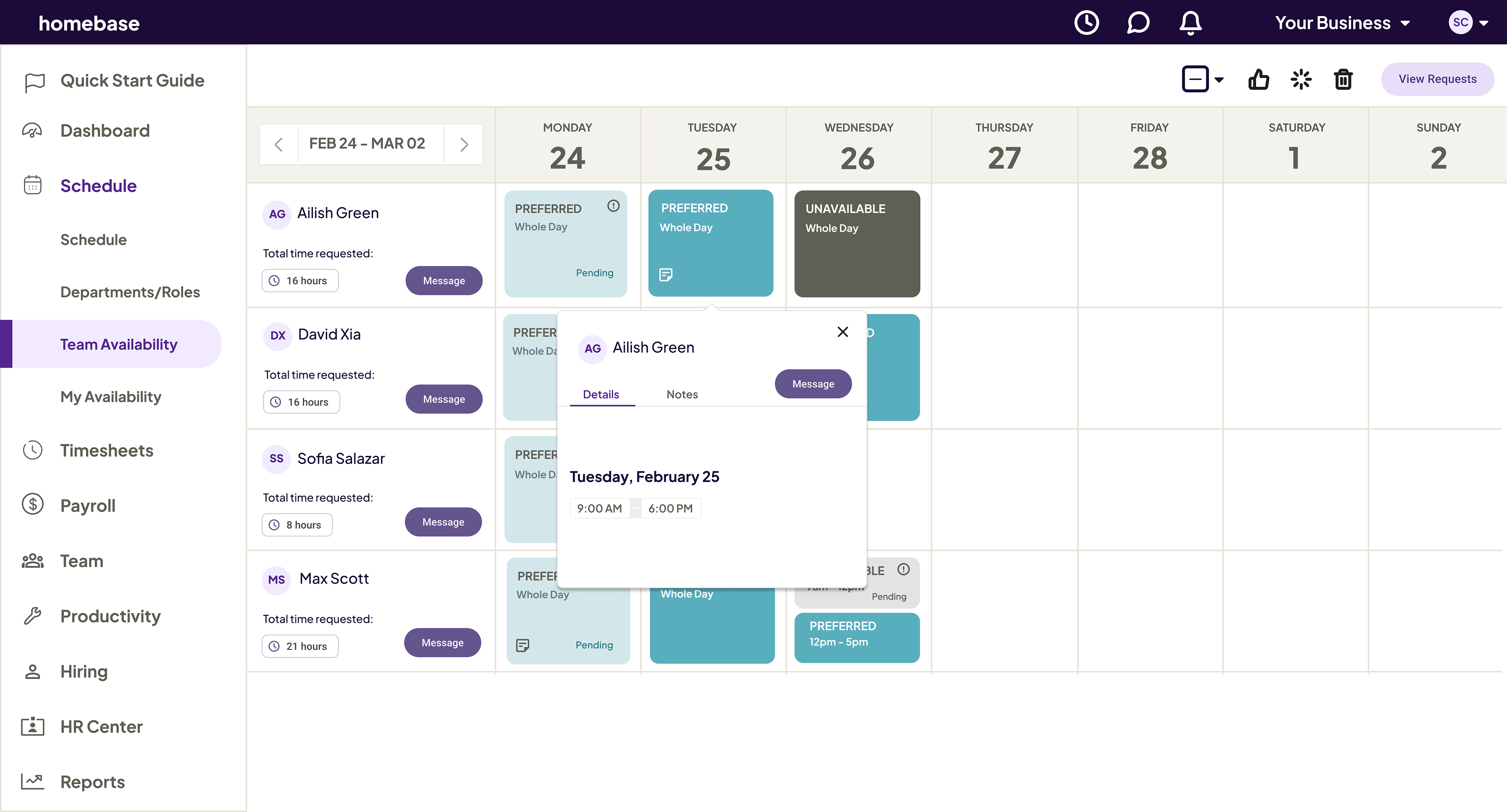
Final redesigns of the Homebase schedule section.