Val’s Vegan Kitchen’s paper-based inventory system was slow, error-prone, and hard to manage across multiple storage locations. Our team created a digital solution that mirrored real kitchen workflows while improving speed and accuracy. User testing led to key changes, including an on-demand legend, location-based navigation, and a Low Stock view sorted by urgency, resulting in faster, more intuitive inventory management.
UCSD '25 Usability and Information Architecture
Timeline: Jan 2025 - March 2025 (10 weeks)
Tools: Figma, Google
Collaborative (Team of 3)
Role: UX Research, Team Direction, Visual Design, User Testing, Final Design
Problem Statement
Val’s Vegan Kitchen relied on a paper-and-clipboard inventory system, leading to inefficiencies, misplaced records, and difficulty tracking ingredient levels. The team was tasked with creating a digital solution that could streamline operations, minimize errors, and work seamlessly in a busy kitchen environment.
Insights
We conducted a full inventory audit to understand existing workflows. Items were documented by storage type, category, product name, packaging, quantity/unit, and prep date. Separate spreadsheets were created for each location (e.g., Kitchen Freezer, Walk-in Freezer) plus a master sheet for quick reference.
We collaborated to create a detailed layout of all inventory items, organized by:
- Product Category and Name
- Location
- Container/Unit
- Quantity (Total and by location)
-Preparation date and/or time
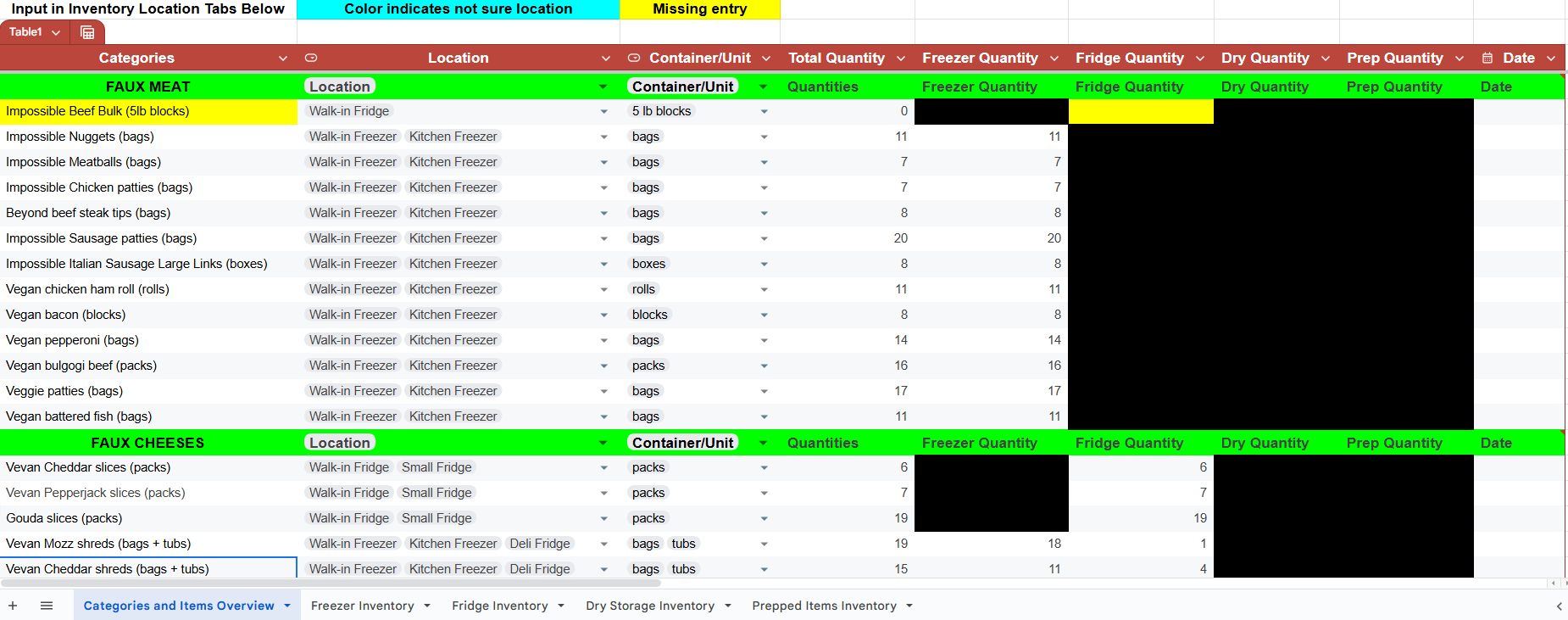
Our Initial Master Reference sheet
Challenges
Designing a digital inventory management system for Val’s Vegan Kitchen meant balancing efficiency, clarity, and ease of use in a high-pressure environment. Our primary challenges included:
Rush-hour usability – The system needed to allow quick, accurate input with minimal disruption to kitchen workflow.
Reducing information overload – Large amounts of inventory data had to be presented in a way that was easy to scan and digest.
Multi-location integration – The system had to support seamless inventory tracking across multiple storage locations within the kitchen.
These constraints shaped our approach to layout, navigation, and visual hierarchy from the beginning, but also revealed new issues during usability testing, particularly around information density and navigation clarity.
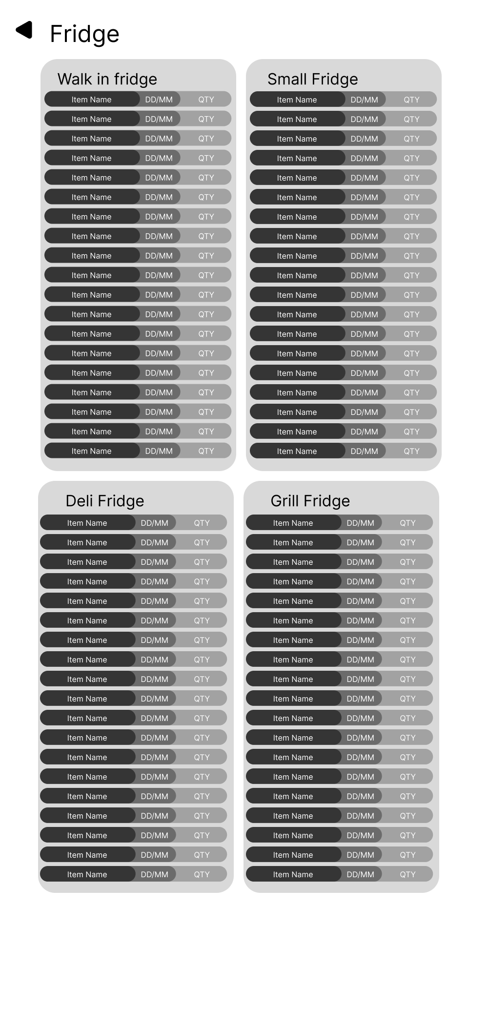
An early low fidelity prototype that we used to test layouts.
Designs and User Testing
A further iteration of the previous design. In the style of traditional dining restaurants, was an experiment in how a menu version of inventory could look
Testing with first-time users revealed several issues:
Visual overload - dense text in the inventory-by-item view felt overwhelming
Persistent legend - users found the always-visible legend distracting from the main task
Navigation uncertainty - hesitation when choosing between similar actions, and difficulty locating Google Sheets tabs at the bottom of the interface
Observing these sessions made it clear we needed to simplify visual hierarchy, provide on-demand guidance instead of constant on-screen help, and make navigation more discoverable.
Lower fidelity versions of our eventual add/remove feature
Solution and Final Design
We redesigned the interface with clarity, speed, and alignment to real-world workflows in mind:
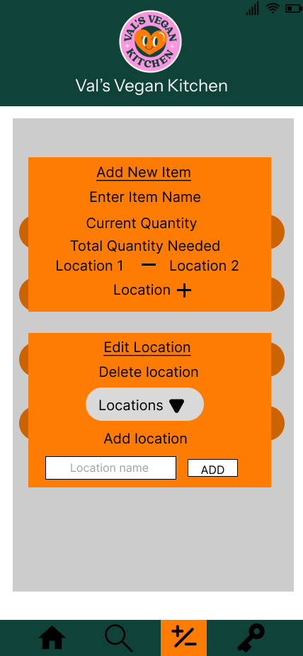
On-demand legend - moved to a menu button at the bottom for quick reference without clutter
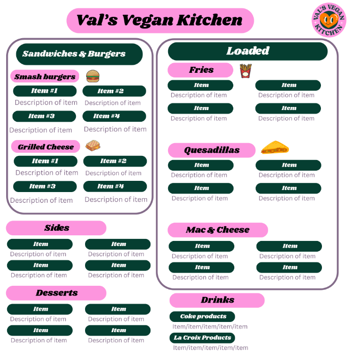
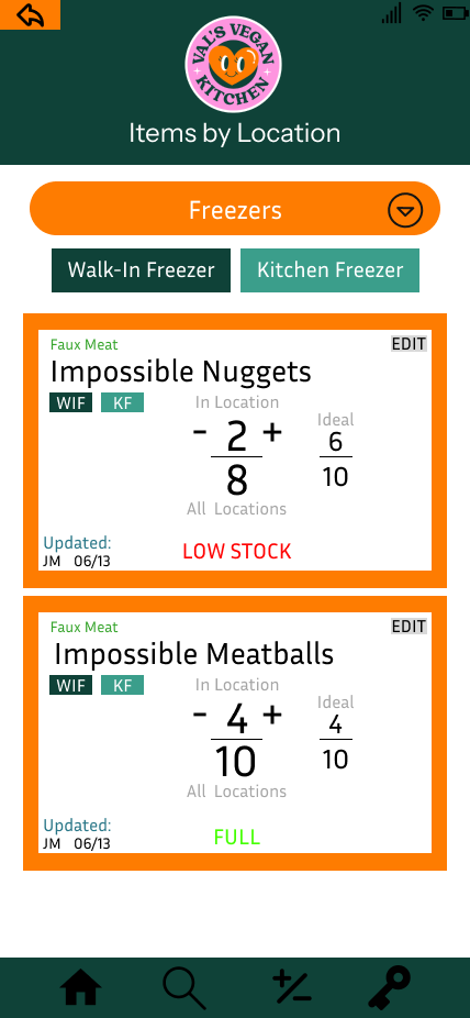
Organized by location → category - mirrored the physical layout of the kitchen for intuitive navigation
Low Stock view - highlighted items below 50% stock, sorted by urgency
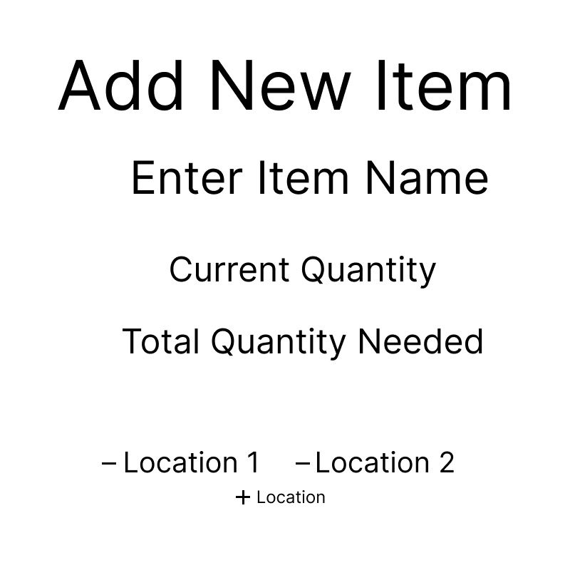
Global +/- button - enabled adding or editing items from any screen
These updates reduced cognitive load, improved navigation speed, and made the system easier to use during peak service hours.
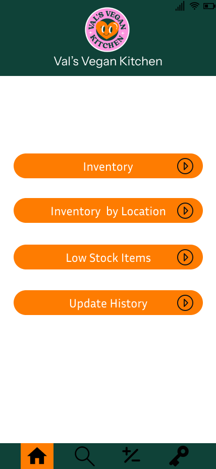
Homepage
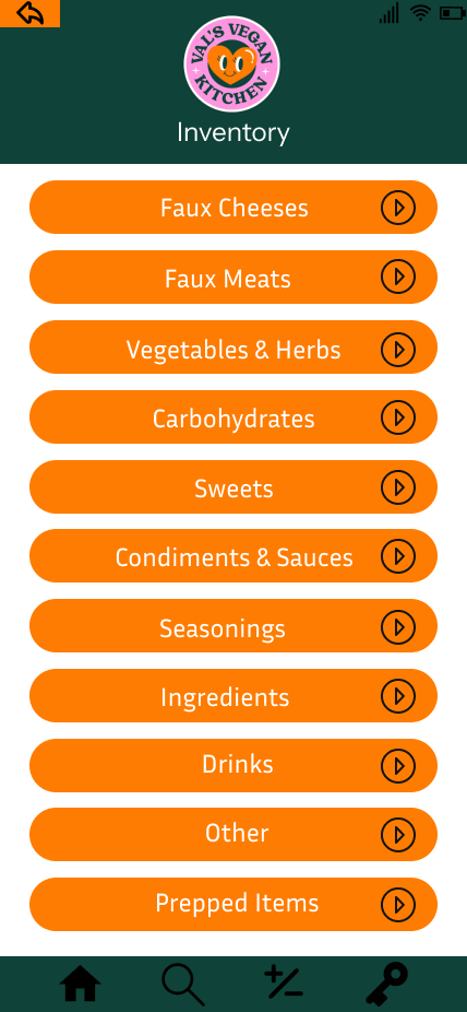
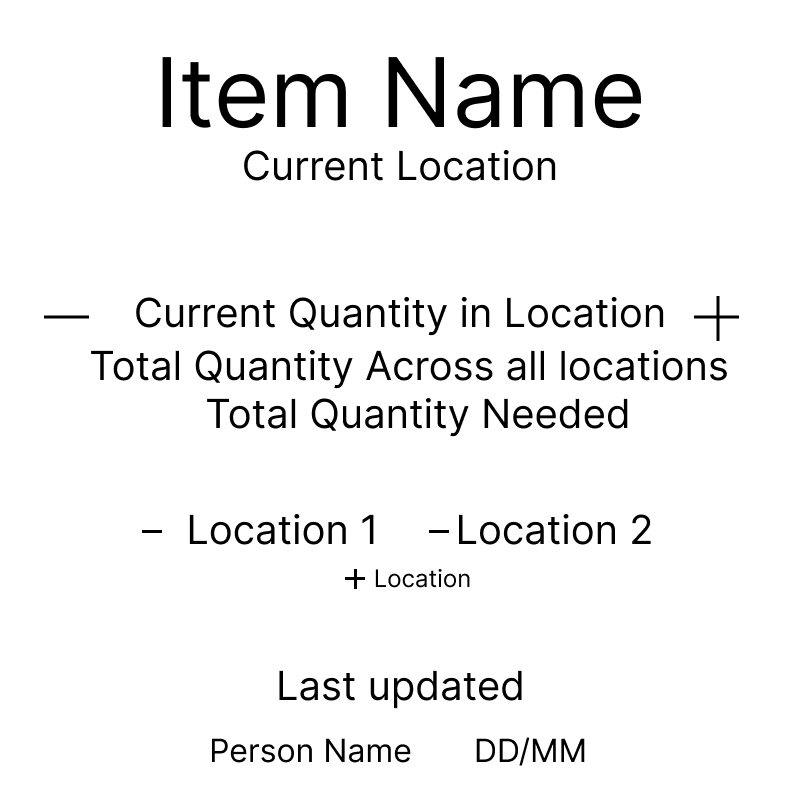
Inventory
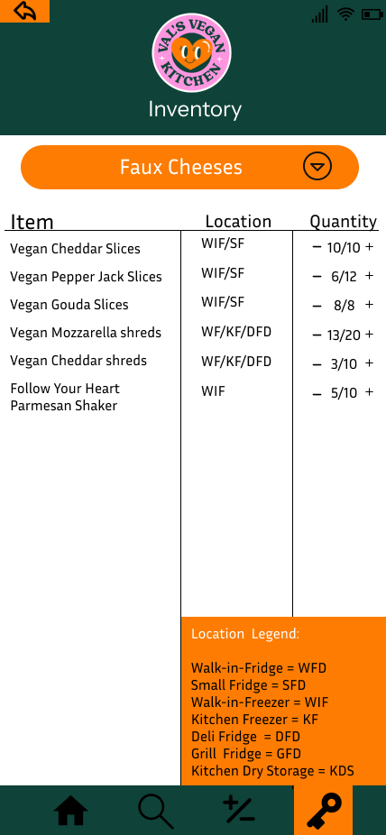
Inventory + Pop-up Legend
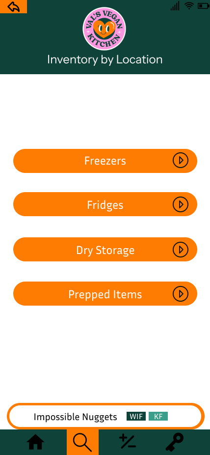
Search Bar + Inventory by Location
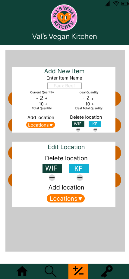
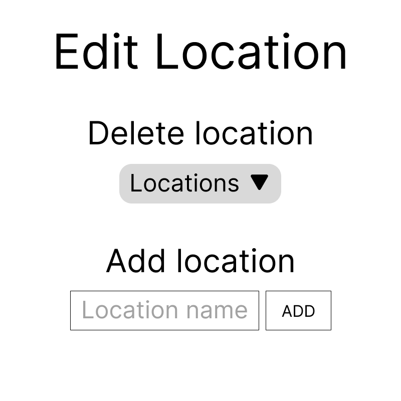
Add/Edit Item and Location
Expanded Information/Detail View
Reflection and Future Changes
The project reinforced the importance of aligning digital tools with physical workflows and validating design assumptions through real user testing. Our next steps would include:
- Live testing in an operational kitchen over a week
- Refining interactions and visuals for accessibility
- Aesthetic shift (some aspects hard to look at for long periods, navigation bar difficult to see)
- Further iteration on final designs