
Tango is a language-learning kiosk designed to reduce social isolation by sparking real-time conversations between strangers in public third spaces like cafés and libraries. Our team created an intuitive interface that matches users based on language goals and interests. The final design encouraged interaction, earning positive feedback for usability and clarity.
UCSD '25 Design Prototyping
Timeline: Jan 2025 - March 2025 (10 weeks)
Tools: Figma, Inkscape, iPad, Physical Materials
Collaborative (Team of 4)
Role: User Research, Personas, Information Architecture, Wireframing + Low Fidelity Protoype (collective), High Fidelity Prototype (collective), Style Guide (collective), Usability Testing
Goals
This project sought to explore how we might design a language learning kiosk that could not only support personal language development, but could also:
- Encourage meaningful social interactions
- Help individuals feel comfortable engaging with strangers
-Foster a sense of community and belonging within a public space.
Problem Statement
In our increasingly digital world, third spaces - public areas where people gather outside of work and home - are fading, a trend accelerated by the post-COVID era. Many individuals, especially students and young adults, report feelings of loneliness and struggle to initiate conversations with strangers. These missed moments of connection contribute to long-term social isolation and negatively impact mental well-being. As a team of multinational students living in a diverse and vibrant community, we wanted to design a solution that brings people back together through meaningful, face-to-face interaction.
Research and Insights
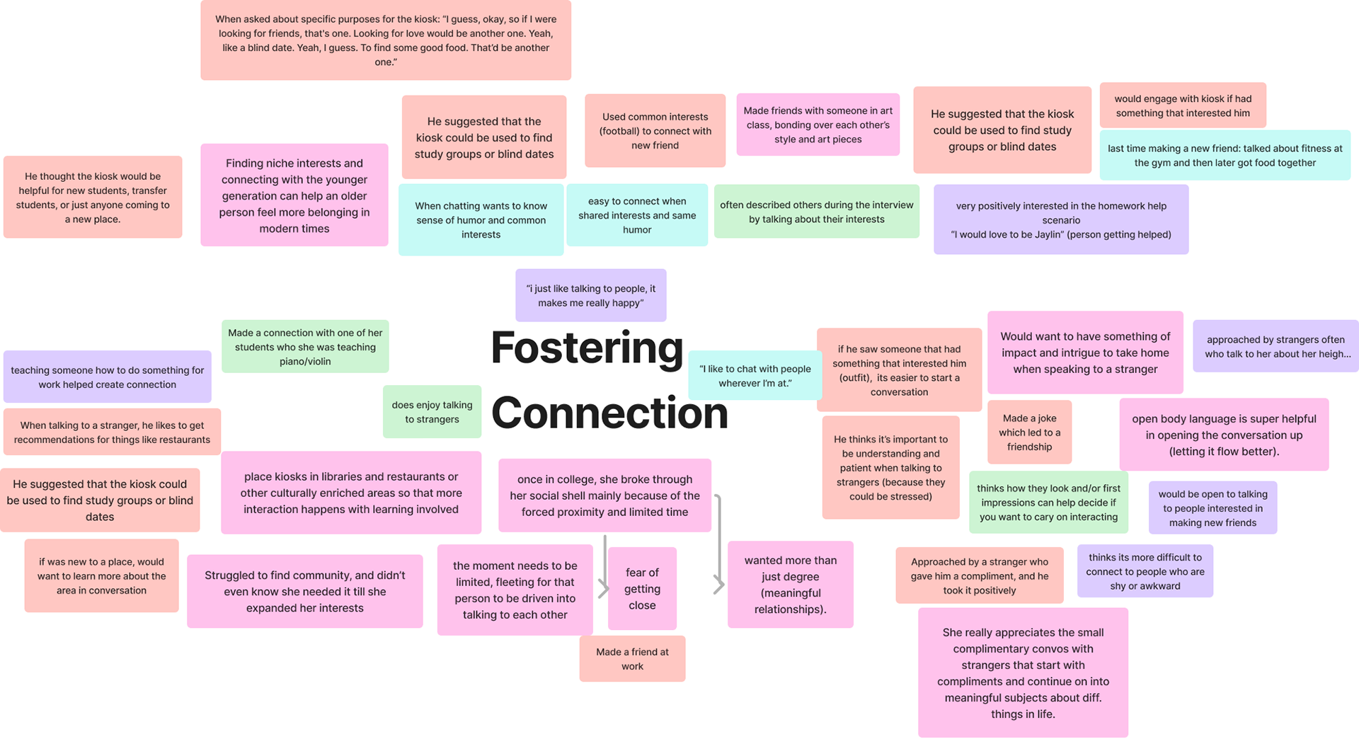
A collection of quotes and insights through guerilla interviews. We eventually compiled three more pages of this, along with interview notes.
Guerrilla interviews, contextual observations, and secondary research revealed that people often wanted to connect, but hesitated due to insecurities and worries about being judged, awkwardness, or not knowing what to say. One participant, an overseas student from China, described a deep loneliness he felt due to arriving in a new country mid-semester, and served to illustrate how social momentum could leave newcomers behind.
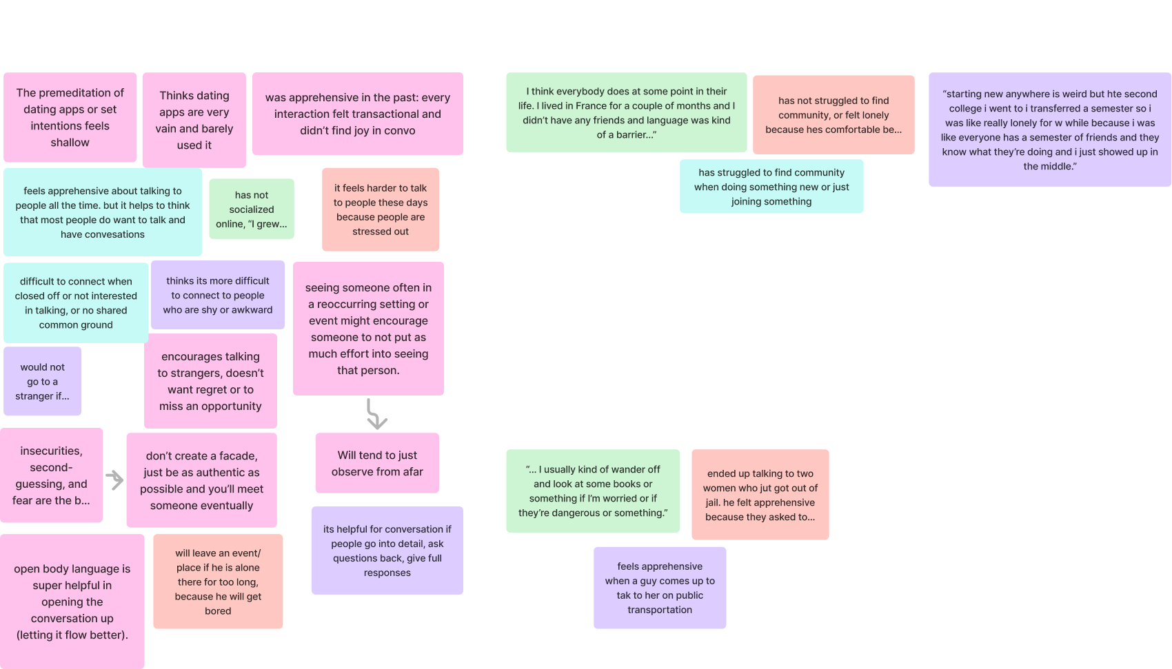
Further insights.
We found that people are more likely to use kiosks if they see others using them first, confirming the importance of visibility and onboarding. Additionally, we discovered that movement, color, and social cues could make people feel more welcome. Research on gesture-based interactions also supported the idea that “observe and learn” behavior in public kiosks could help users feel more comfortable engaging.
Challenges
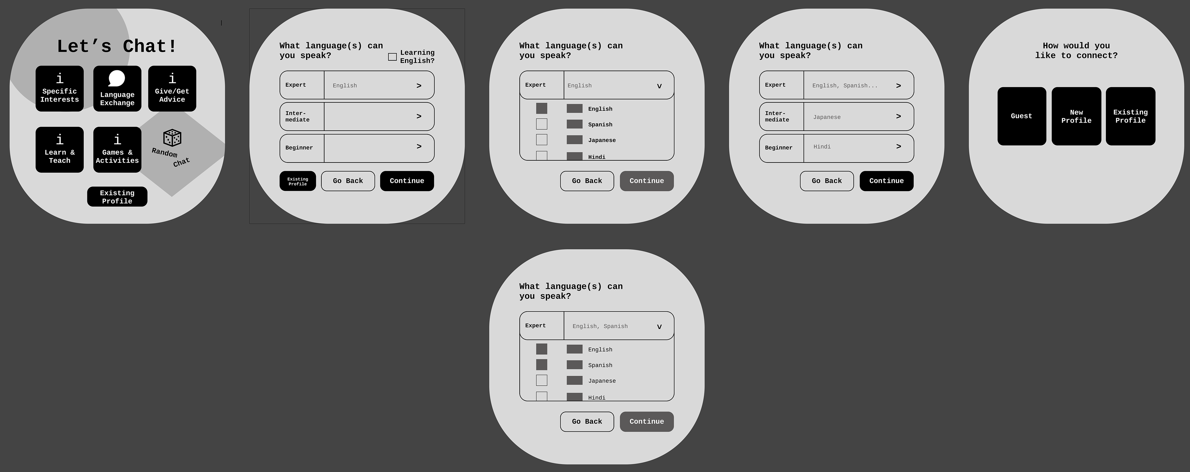
An initial prototype of Tango.
One of the key challenges we faced however, was attempting to balance functionality with approachability. The initial concept for Tango was less of a language learning kiosk, and more of a general social kiosk similar to applications like Tinder. Ultimately, it proved to be too broad of a concept, and one that didn't fit our goals. We also initially wanted our screens to be more information dense, which while functional didn't prioritize clarity and ease of us as well.
Solution and Final Design
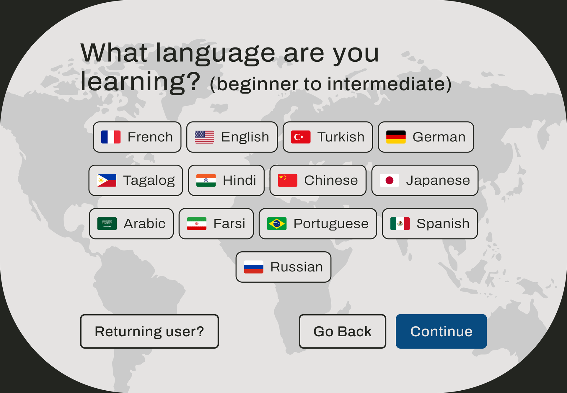
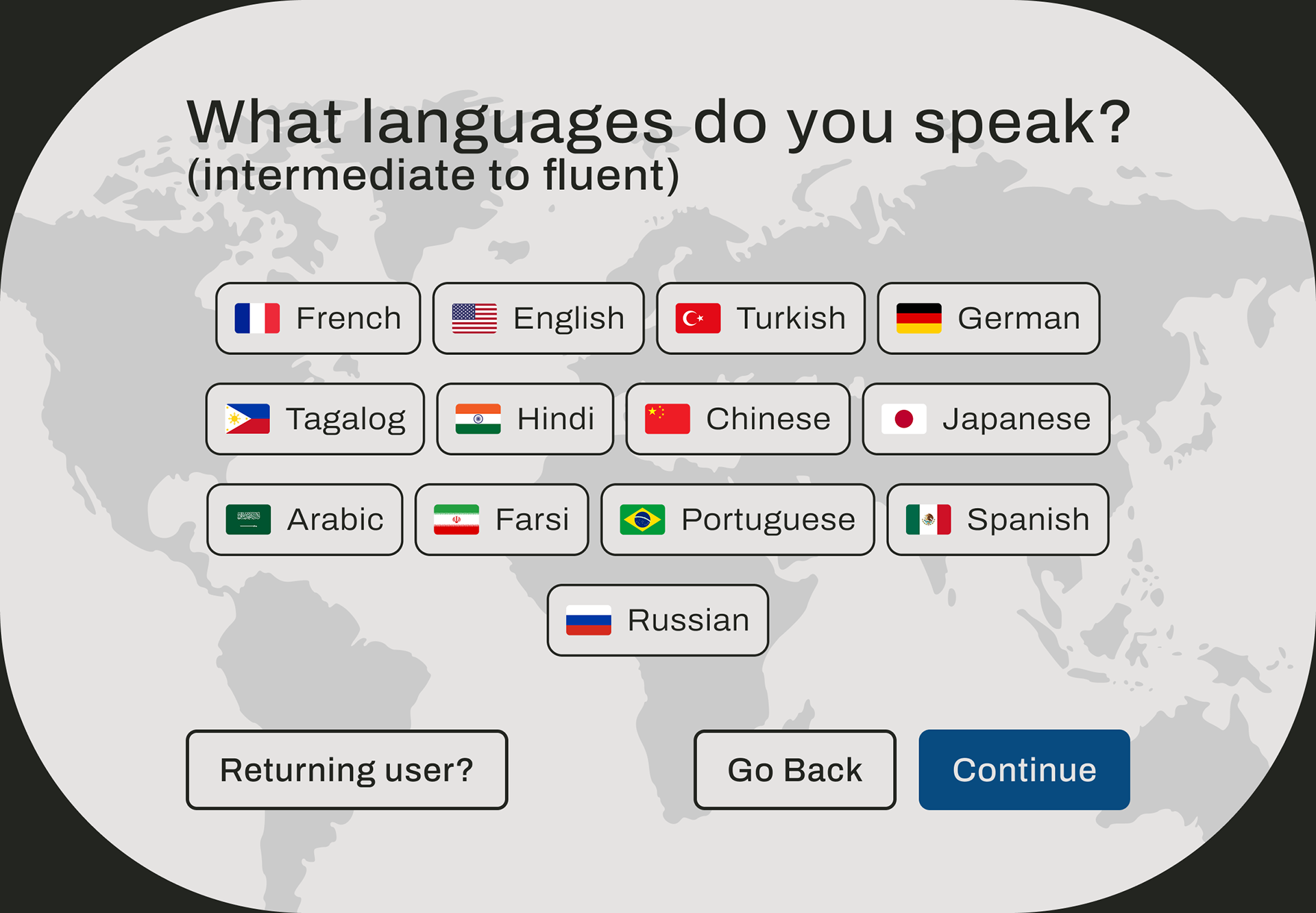
Our solution eventually manifested in this version of Tango, a physical kiosk that was intended for placement in high-traffic third spaces such as cafes, libraries, and university campuses. The kiosk enables users to create a profile, choose the language they speak and one they wished to speak or practice in, as well as selecting personal interests. Based on this data, the kiosk would match users with others that were in the same location who were looking to participate in language exchanges.
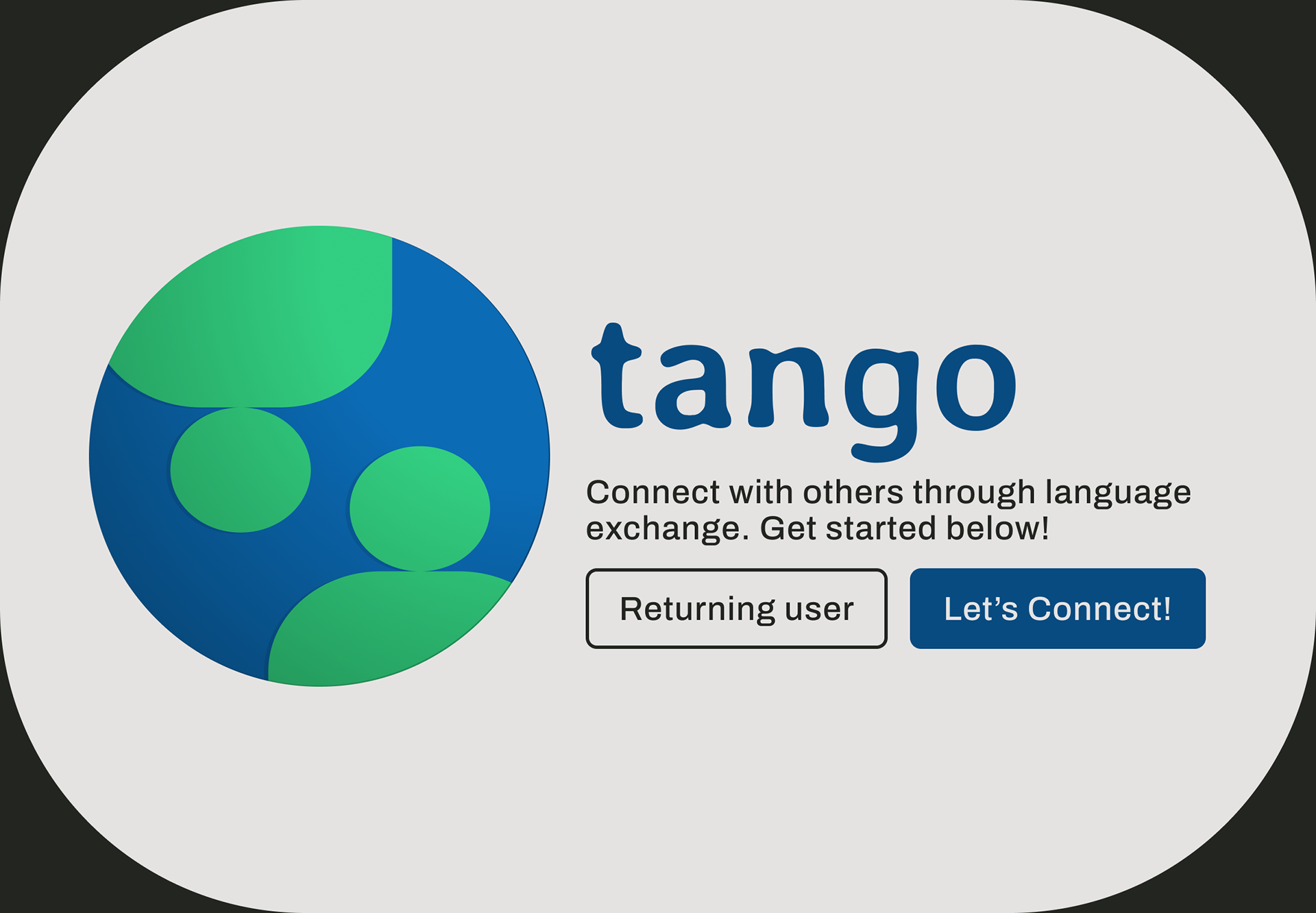
Landing Page
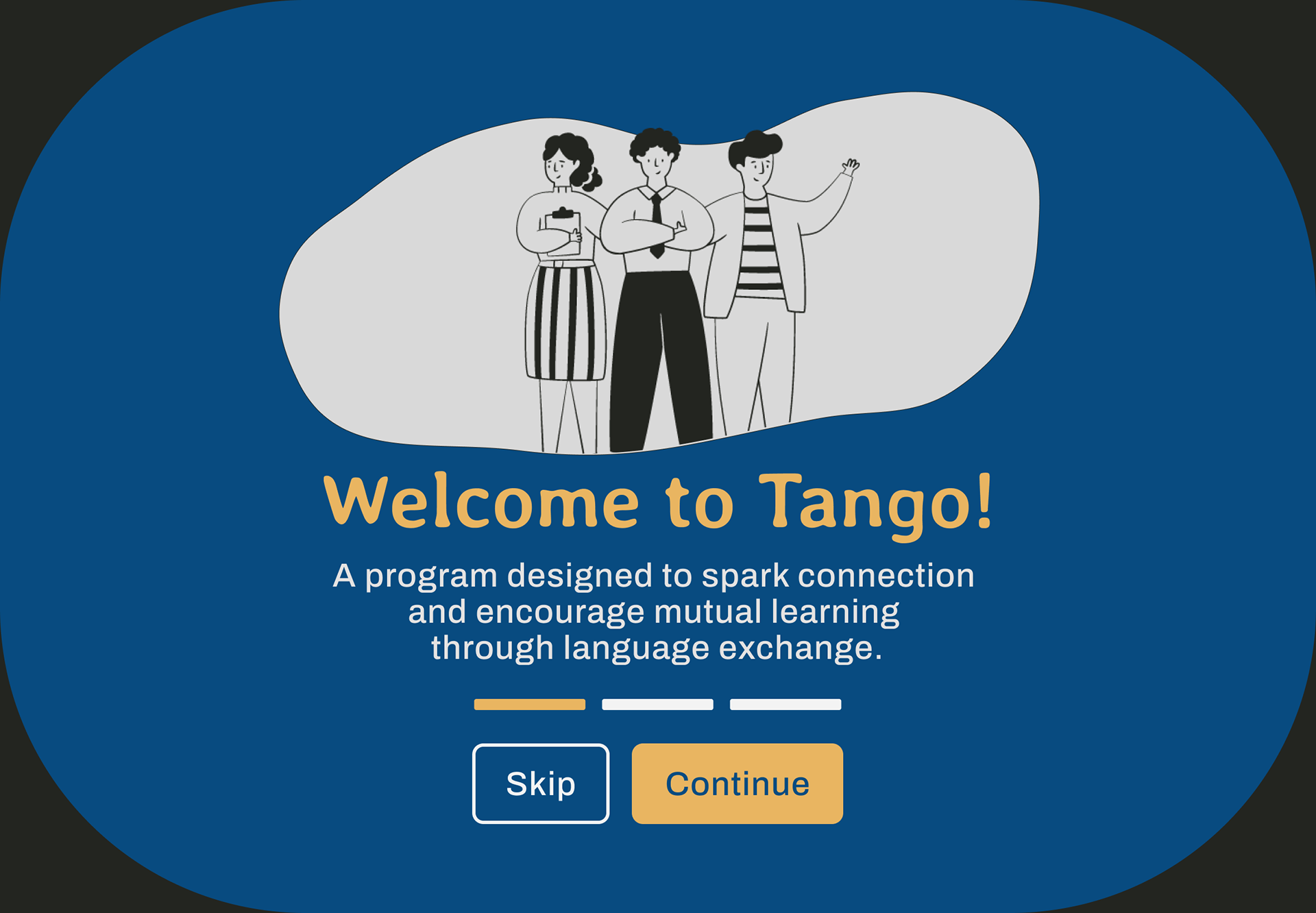
Welcome page
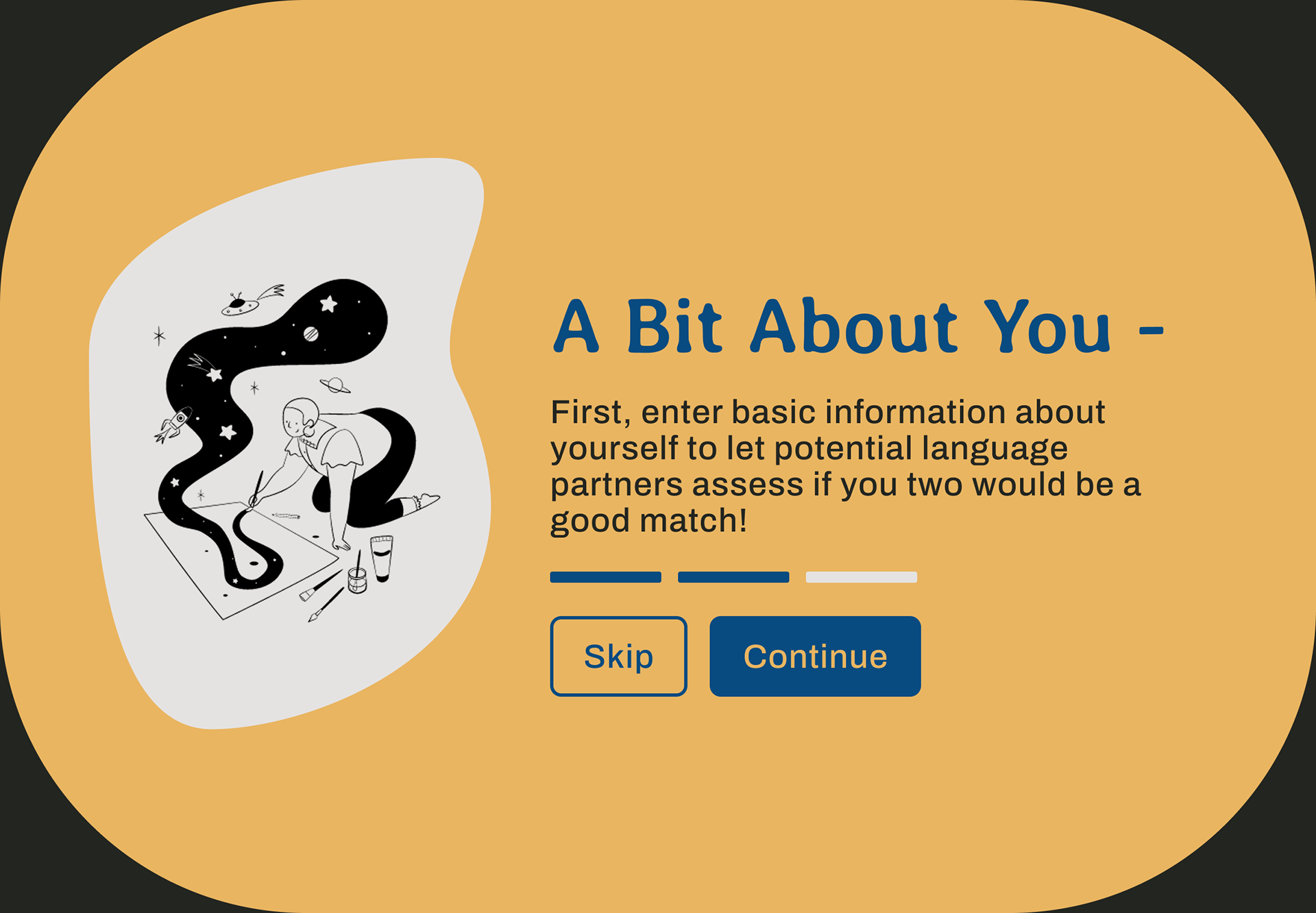
Instructions
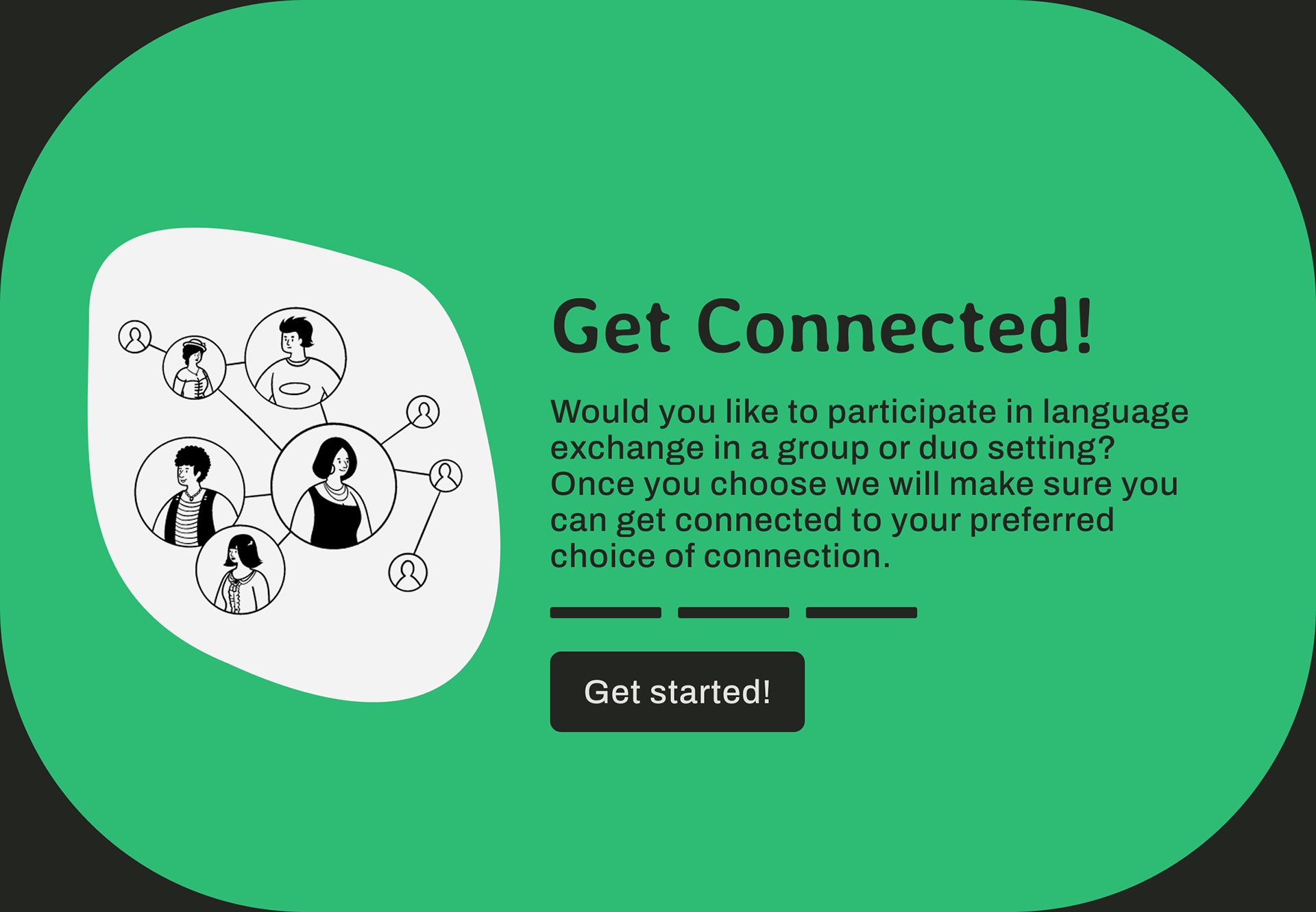
Instructions Part 2.
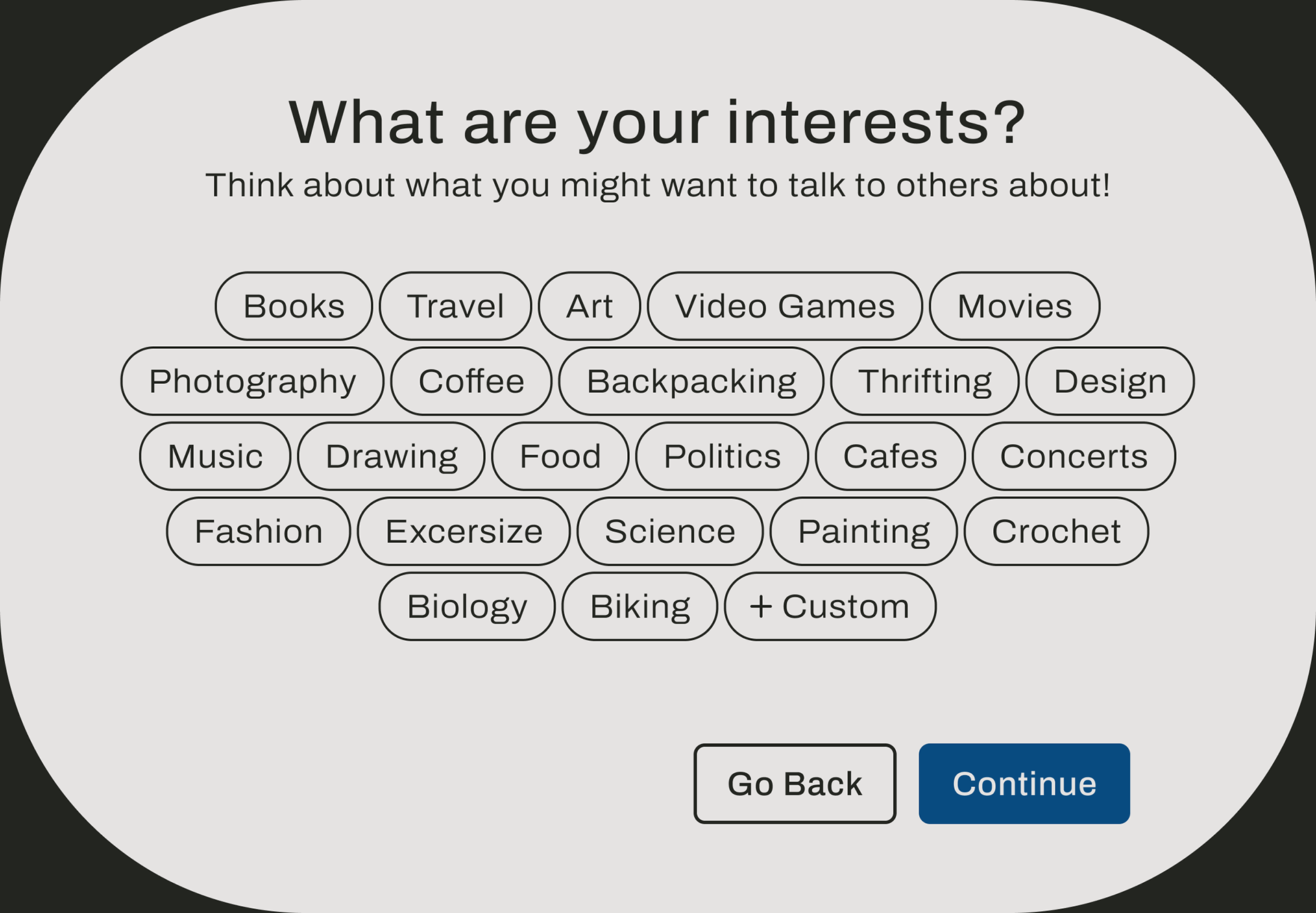
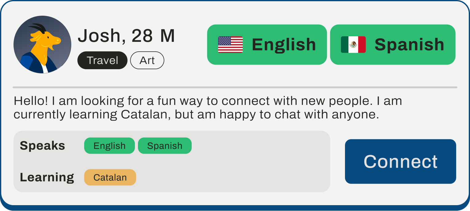
In an effort to reduce user friction, the kiosk sends a text message with the meeting location once a match is made. Users can also join or create group meetups, browse language events happening on-site, as well as explore conversation prompts. The UI was designed to both approachable and intuitive, using minimal steps between prompts and using a playful design to encourage users to use the kiosk.
Outcome and Reflection
Through iterative design, our final kiosk featured improved icon sets, stronger on-screen onboarding and a more intuitive match filtering. All participants in our final round of usability testing and showcase acknowledged the purpose of the kiosk, especially in settings where individuals spend time alone and may not wish to. Both the team and the users tested believe that public interfaces can promote real world connections when designed with visual clarity appeal, ease of use, and strategic location.
A demo of all the screens featured within Tango
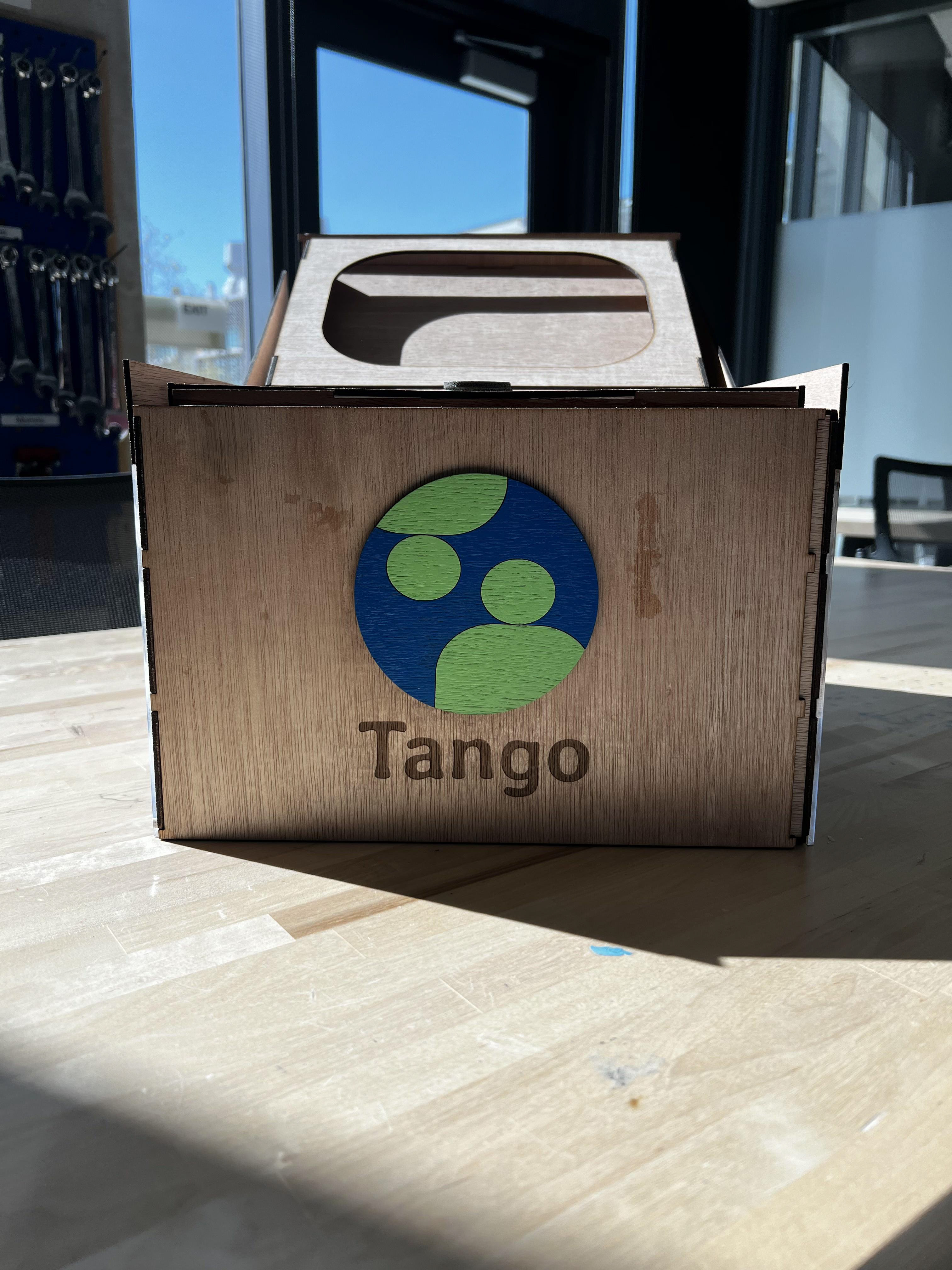
Physical Kiosk. Not pictured: Screen with Tango prototype
Though we didn't deploy the kiosk in a live setting, the positive feedback left us confident that we achieved the goals we set before us. The kiosk's construction challenged myself and my team to think beyond screen-based design and into the physical world. In designing for real world interactions, it meant considering user comfort, perception, and their hesitation to socialize in public settings. If we were to take this further, a pilot and further accessibility considerations would be able to be integrated.